Structuring a Page with CSS
Page layout can be one of the trickiest aspects of web design. Different approaches have been taken over the years such as the use of tables in the days before CSS. CSS introduced a number of ways to control layout, although initially, CSS itself didn't provide any systematic approach to page layout, it did provide several properties which could be used to change where HTML elements would appear in the page.
Later, grid systems appeared as part of CSS or larger frameworks. These are primarily HTML layouts because they do tend to rely on properly structured HTML. For example, grid systems often rely on the use of HTML classes and ids to layout the elements. A new model, the flexible box model, began to appear around 2016 and this led to improvements in the way layouts are created, although it is not without its limitations.
Any of these approaches might be adopted for your page layout (although I think it would be fair to exclude tables from that in most circumstances). The main thing is that whatever approach you adopt should be applied consistently but even more important than that, the approach should make sense for whatever project you are applying it to. Even the principle that an approach should be applied consistently should only be adhered to if it makes sense for your project. For example, if you are creating a page where the desired layout is difficult to achieve with whatever approach you are taking for the project as a whole, you shouldn't worry about taking a different approach for that page.
Element Positioning
It is possible to control where an element appears both in relation to other elements and the viewport. You should remember that by default, block elements are positioned as a stack, one on top of the other whereas inline elements are positioned inside block elements. In this context, we could view an element as a kind of line-box where the contents (this might be text in a paragraph for instance or other elements such as links, images and so on) are arranged in a line from left to right with these contents flowing over onto as many lines as are necessary. You could make an analogy here with a Word document where block elements are like paragraphs and inline elements are like words.
If we don't do anything to position the elements in a page, the browser will arrange them according to this model, that is with block elements displayed vertically in sequence and inline elements displayed horizontally in sequence within a block element. CSS defines three positioning schemes, of which this is the first and it is referred to as normal flow.
The other two schemes are element floating which will be covered in the next section and absolute positioning which we will cover here. To use the absolute positioning scheme, we specify, for an element, the position property and this can take one of five values.
inherit
The element takes the position value of the parent element
static
This means that the element will be positioned according to the normal flow of the page and it is the default.
relative
A relative position is similar to a static position. The main difference is that it allows you to specify an offset. The offset is generally specified as being relative to the top left corner of the viewport and is expressed as a distance from the left side and then from the top. As an example, you might move an element over to the left side of the screen. However, this will create a space to the left of the element and any element below it will not move up to occupy this space.
To see how this works, please see the page relative.html (opens in a new tab).
absolute
This is similar to relative positioning in terms of how it is defined (as an offset from the left and top edges of the viewport. However, an element specified with an absolute position is removed from the normal flow of the page.
To see how this works, please see the page absolute.html (opens in a new tab).
If you inspect both of these pages, you will see that the boxes don't move to occupy the space vacated by moving box1 when relative positioning is used, but they do when we use absolute positioning.
Positioning an element in this way can be quite difficult to do. When we use absolute positioning, the element looks for the nearest element to it that has positioning and if none are found, it looks to the body so the element is being positioned relative to the viewport.
Let's say that you have an HTML layout with three sections, a header at the top which occupies the full width of the screen and two sections below it, a sidebar to the left and a content pane to the right. We then want to add a <div> containing a quote and we will give it an absolute position with values for top and left of 0.
If there are no other positioned elements, the quote would appear in the top left corner of the viewport. However, if specify a position of relative for the content pane (we don't need to specify any values for top and left because we just want to leave the content pane where it is - this just ensures that any subsequently positioned elements are positioned relative to the content pane), the quote would appear in the top left corner of that content pane.
fixed
Using fixed positioning is very similar to using absolute positioning with one exception, and that is that the element positioned in this way is always relative to the active viewport. As we know, the viewport is the visible part of the screen - that is the portion of the web browser that displays our page. The active viewport is similar but this refers to the part of the page you are viewing at any given time. In other words, it is the specific part of the web page currently displayed in the viewport. This means that if you have an element in the page with a fixed position, let's say you have a logo in the top left of the screen, when you scroll down the page, the logo will remain visible in the top left corner of the viewport.
An example of the use of this is on my Web Development Links page which is currently under development so it may not be obvious at the moment but there is a menu on the right hand side with a fixed position so even if the list of links in the main page is large enough to require the user to scroll through them, the menu will stay in the same position.
One final note here, we have seen that positioning can lead to an overlap of elements on the page and by default, you will see that a positioned element will always appear to be on top of a non-positioned element. However, you can use the z-index attribute to determine the order of these - that is, which is overlaid on top of which. This would look something like
	.content {
		z-index: 1;
	}

	.quote {
		z-index: 2;
	}
Floats
You will see floats being used quite commonly but they can also be quite confusing. It is probably better to think of a print layout where you have images embedded in your text. The float property allows you to have the text float around the image. Consider the following example.
	<p>This is some text.  It isn't of any great importance.</p>
	<img src="samples/DSC_1250-1.jpg">
	<After the text, we have an image and then this paragraph.  Note that we have a sequence of elements with a paragraph followed by an image and then followed by another paragraph. No styling has been applied to the image as yet.  However, I will apply a float and see how this affects the code.>
On the webpage, this is going to look as follows.
		This is some text.  It isn't of any great importance.

		After the text, we have an image and then this paragraph.  Note that we have a sequence of elements with a paragraph followed by an image and then followed by another paragraph. No styling
		has been applied to the image as yet.  However, I will apply a float and see how this affects the code.
So there we have an example where we are stacking elements where they formal the normal flow.
		This is some text.  It isn't of any great importance.

		After the text, we have an image and then this paragraph.  Note that we have a sequence of elements with a paragraph followed by an image and then followed by another paragraph. This time,
		we have applied the float attribute to the image with a value of left.  As you can see, the image now appears on the extreme left of the screen and the paragraph and you can see that the paragraph floats around the image.
These elements are still following the normal flow but the second paragraph is placed next to the image rather than below. Now, remember than <img> is an inline element so we should be able to place it inside a paragraph.
This is some text. It isn't of any great importance.
After the text, we have an image and then this paragraph.
It may be worth noting a couple of things about these examples. The first is that they are positioned within <pre> tags in the HTML to male formatting the code easier and to make it stand out. I have styled the page so that anything within a paragraph that is within a <pre> element has a lighter background. This is intended to make code samples stand out but it is useful here in that it does make perfectly clear that although the paragraph wraps around the floating image, the image is not part of the paragraph. As you may expect, in the last example where the image is embedded in the paragraph, it now is part of the paragraph.
The second point to make is that since the examples are contained within <pre> tags, I have had to manually insert the line breaks and these can result in a paragraph that looks a little "off".
The float attribute can have a value of left, right, none or inherit. Left or right will push the element as far to the left or right as it can go and any elements, much like we saw with absolute positioning, is then going to move up to occupy the space it leaves. As a result, floats can be used as a simple method of creating a two-column layout for instance.
Because of the way float works in relation to the normal workflow, it can lead to confusing results sometimes. For instance, let's say you have a layout with a header section, a sidebar, a content section and a footer and you apply
The result can be seen above. Notice that the footer has been moved up to sit between the sidebar and content panes and this is a reflection of the fact that the footer, which has no float attribute, is not stacked below the floated elements. In fact, nothing else that comes after these elements is being stacked below them, including this paragraph. The result is very messy, but it does demonstrate how frustrating it can be using floats for layouts. This is something I have experienced in the past and I would probably have resolved it by using line breaks to push the paragraph down so that it is properly positioned but I think that you should remember that when you are using line breaks like this, it is usually because you got something else wrong.
Now let's see these elements again with one critical difference.
This time, everything seems to have lined up correctly and this is because on the footer element, we have cleared floats in the footer with
clear: both;
This has the effect of placing the footer after the floated elements. Note that I have increase the width of both the sidebar and content panes to make it look a bit neater but even if there was a gap, as there had been in the previous example, the footer would still be positioned correctly.
It's not really usual to have blocks like these with different colours. Usually, you create these different elements simply so that you can put certain types of elements in each such as links in the sidebar and an article or blog posting in the main part, but you would have a cohesive colour scheme and would only make the background colours different if it made sense for the page. However, in practice, I have found that when you want to create a page with sections laid out with float, it can make a lot of sense to do this. That is, when starting to create the website, you can create the different sectional elements and give them bright background colours. This allows you to very easily see how these different sections fit together. Once you are happy with the positioning, you can remove the background colour or set it to something less garish and then start to place additional elements inside these sections knowing that they will now appear in the right place.
The float attribute can be quite hard to master and it may not be necessary now that more modern methods are available. If you do want to master floats, and bear in mind that even if you don't use them, you may still see them in use in older web pages, there are a few important points that are key to mastering them.
	1.  It is important to know how floated elements affect their parents.
	2.  It is important to know how clearing works.
	3.  You should pay attention to margins between floated elements and static elements.
	4.  You should also pay attention to parent elements affects the floating of elements nested inside them.
These are the things you need to know about if you want to master the float attribute. There is a tutorial on css-tricks.com which looks quite interesting and is probably a good starting point for further study on the subject.
Flexbox
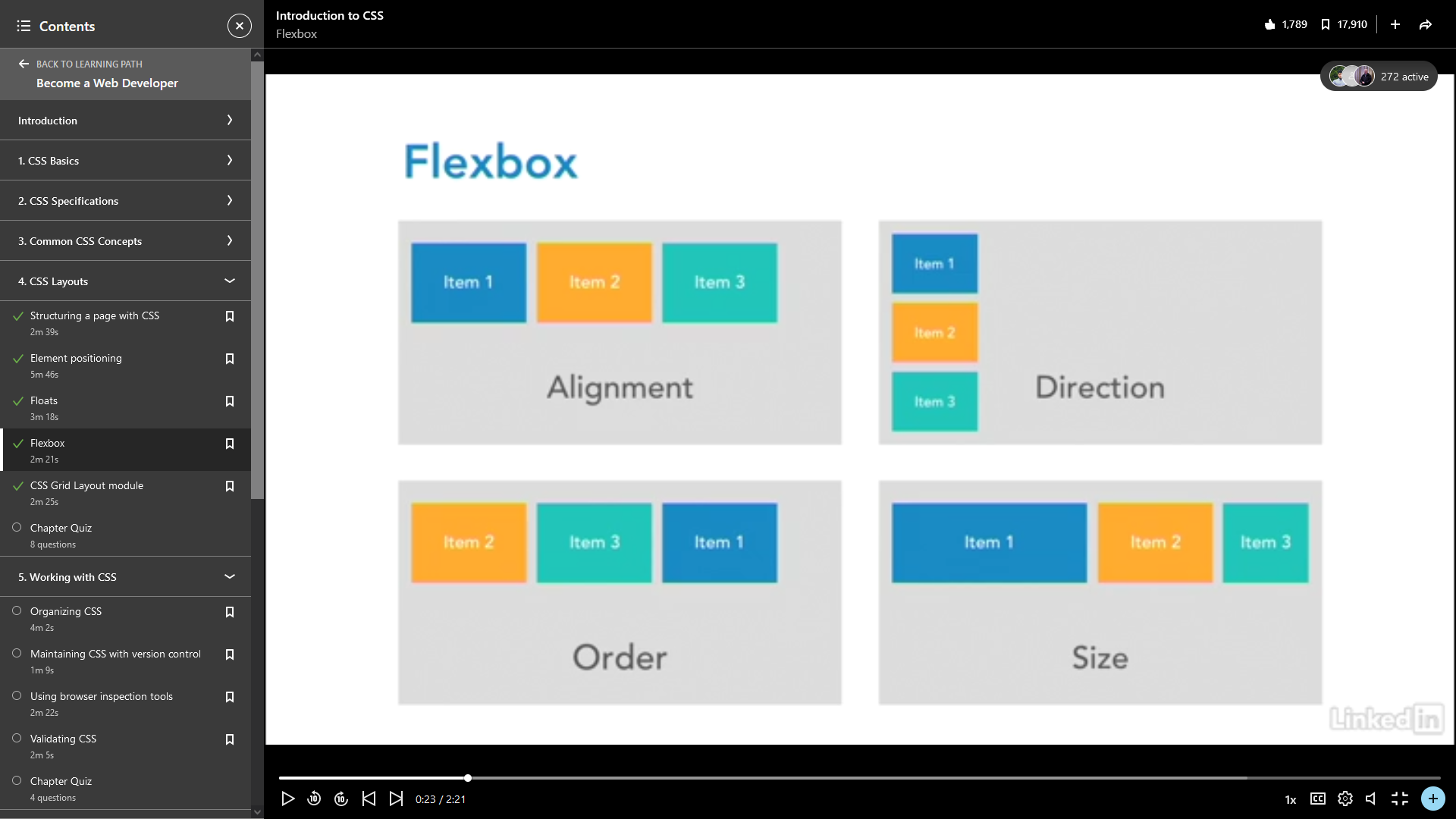
Flexbox is a one dimensional layout layout model. That it is it allows you to layout elements along either the horizontal or vertical axis of a parent element (see the image below), but it does provide quite a a bit of flexibility in terms of the child elements are laid out relative to the parent. CSS defines two axis, the Main axis is horizontal and so the left side of the screen is defined as the Main start and the right side as the Main end. The vertical axis is the Cross axis, running from Cross start at the top of the page and Cross end at the bottom. When you add child elements to the flex container, these are automatically defined as flex items which can be laid out in any direction by using flex properties. Their sizes can be flexible so that they can shrink or expand, depending on the size of the viewport.
The parent element is defined as a flex container and it also defines the flow direction for its child elements. In order to experiment with this, I have created an HTML file called links_flex.html which contains a header followed by a div with a class of "content" which is going to be defined as a flex container with child elements flowing horizontally. The CSS for this page is in a file called links_flex.html.
The CSS to define this is
	.container {
		display: flex;
		flex-direction: row;
	}
The display property is what we are using to define the element as a flex container and the direction of flow is controlled by the flex-direction property. I have given it a value of "row" so the child elements will flow horizontally. For a vertical flow, this value would be column. This is an important concept because many of the flex properties will be measured along this axis. Within the flexbox container, the child elements determine how they interact with other elements in the same flex container and this can be used to create some neat effects such as different columns having the same height where that height is governed by the 'tallest' column. This means that the layout is dependent on the content.
Flex box can be quite powerful, but it isn't really suitable for a full layout, it's really better used within another grid system or for laying out part of the page as well began to investigate with flex_links.html.
There is not really much detail in the video on how to use flexbox so I have created a new folder called projects which I will use to contain pages like links_flex.html in which I can experiment with different aspects of CSS and also HTML and JavaScript.
CSS Grid Layout Module
CSS Grid is a more modern layout system again and unlike flex, it is a two dimensional system. You can draw a grid inside a container and content can then be placed anywhere in that grid. In a lot of ways, this is similar to using a table structure for layout.
You define a container as a grid via its display property.
	.container {
		display: grid;
	}
Since it is two dimensional, you don't specify a flow direction. A grid has the following properties.
Rows - the horizontal line.
Columns - the vertical line.
Grid lines - the lines that make up the grid.
Grid tracks - the spaces between grid lines.
Grid cells - the area between 4 grid lines, top, right, bottom and left.
Grid area - any area within the grid defined by specifying its outermost grid lines, it can span multiple rows and columns and can therefore contain multiple cells.
There are other properties, but these are the basic components for creating a grid. At the time the course was recorded, this was quite new, I believe it first appeared around 2016 so browser support was patchy, but from looking at caniuse.com, it seems to be much better supported now with global coverage of just over 95%.
In the previous section, it was noted that flexbox is not ideal on its own for creating layouts, but it does work quite well with CSS Grid to provide an effective layout with the flexibility of responsive design.
Both flexbox and CSS Grid have been barely touched on here, but both are covered in greater detail in CSS Essential Training by Christina Truong.